Relume Style Guide
HTML tags define default Heading styles.
Heading 1
Heading 2
Heading 3
Heading 4
Heading 5
Heading 6
Heading classes when typography style doesn't match the default HTML tag.
Heading-style-h1
Heading-style-h2
Heading-style-h3
Heading-style-h4
Heading-style-h5
Heading-style-h6
Heading classes when typography style doesn't match the default HTML tag.
Heading-style-h1
Heading-style-h2
Heading-style-h3
Heading-style-h4
Heading-style-h5
Heading-style-h6
HTML tags define default text styles.
Lorem ipsum dolor sit amet, consectetur adipiscing elit. Suspendisse varius enim in eros elementum tristique. Duis cursus, mi quis viverra ornare, eros dolor interdum nulla, ut commodo diam libero vitae erat. Aenean faucibus nibh et justo cursus id rutrum lorem imperdiet. Nunc ut sem vitae risus tristique posuere.
Block Quote
No bullet list
No bullet list
No bullet list
No bullet list
No bullet list
No bullet list
No bullet list
Text sizes classes when typography size doesn't match the default HTML tag.
Lorem ipsum dolor sit amet, consectetur adipiscing elit. Suspendisse varius enim in eros elementum tristique. Duis cursus, mi quis viverra ornare, eros dolor interdum nulla, ut commodo diam libero vitae erat. Aenean faucibus nibh et justo cursus id rutrum lorem imperdiet. Nunc ut sem vitae risus tristique posuere.
Lorem ipsum dolor sit amet, consectetur adipiscing elit. Suspendisse varius enim in eros elementum tristique. Duis cursus, mi quis viverra ornare, eros dolor interdum nulla, ut commodo diam libero vitae erat. Aenean faucibus nibh et justo cursus id rutrum lorem imperdiet. Nunc ut sem vitae risus tristique posuere.
Lorem ipsum dolor sit amet, consectetur adipiscing elit. Suspendisse varius enim in eros elementum tristique. Duis cursus, mi quis viverra ornare, eros dolor interdum nulla, ut commodo diam libero vitae erat. Aenean faucibus nibh et justo cursus id rutrum lorem imperdiet. Nunc ut sem vitae risus tristique posuere.
Lorem ipsum dolor sit amet, consectetur adipiscing elit. Suspendisse varius enim in eros elementum tristique. Duis cursus, mi quis viverra ornare, eros dolor interdum nulla, ut commodo diam libero vitae erat. Aenean faucibus nibh et justo cursus id rutrum lorem imperdiet. Nunc ut sem vitae risus tristique posuere.
Lorem ipsum dolor sit amet, consectetur adipiscing elit. Suspendisse varius enim in eros elementum tristique. Duis cursus, mi quis viverra ornare, eros dolor interdum nulla, ut commodo diam libero vitae erat. Aenean faucibus nibh et justo cursus id rutrum lorem imperdiet. Nunc ut sem vitae risus tristique posuere.
Text weight classes when typography weight doesn't match the default HTML tag.
Text style classes when typography style doesn't match the default HTML tag.
Text alignment classes when typography alignment doesn't match the default HTML tag.
Heading 1
Heading 2
Heading 3
Heading 4
Heading 5
Heading 6
This is a block quote
The rich text element allows you to create and format headings, paragraphs, blockquotes, images, and video all in one place instead of having to add and format them individually. Just double-click and easily create content.
This is a link inside of a rich text
- List item
- List item
- List item
- List item
- List item
- List item

Manage recurring background colors.
Manage recurring text colors.
Shadows allow you to add depth and realism to designs by positioning elements on a z-axis.
icon-height-xxsmall
icon-height-xsmall
icon-height-small
icon-height-medium
icon-height-large
icon-height-xlarge
icon-height-custom1
icon-1x1-xxsmall
icon-1x1-xsmall
icon-1x1-small
icon-1x1-medium
icon-1x1-large
icon-1x1-xlarge
icon-1x1-custom1
Linkable labels that categorize or highlight information on cards, products and posts
HTML embed icons enable you to control icon color on hover.
icon-embed-xxsmall
icon-embed-xsmall
icon-embed-small
icon-embed-medium
icon-embed-large
icon-embed-xlarge
icon-embed-custom1


Edit styling here and copy from inspector, into style tag within page. Or place new styling directly into style page.
November 2021
System Design
Tokeny, komponenty i wzorce interfejsu.
Kolory
Paleta brand + neutrals. Wszystkie kolory dostępne jako Webflow Variables w kolekcjach Brand, Ink i Semantic.
Brand
Neutrals (Ink)
Semantic
Przyciski
System buttonow oparty na istniejacych klasach Relume. Klasa bazowa button + combo-klasy modyfikatorow. Nie tworz nowych klas — uzyj ponizszego systemu.
button + opcjonalne combo: is-secondary, is-tertiary, is-link, is-small, is-alternate (na ciemnym tle).is-alternateKarty artykulow
Karta grid (domyslna). Hover: subtelny shadow + border ink-300. Tagi kategorii jako sg-tag. Awatar autora z inicjalami.
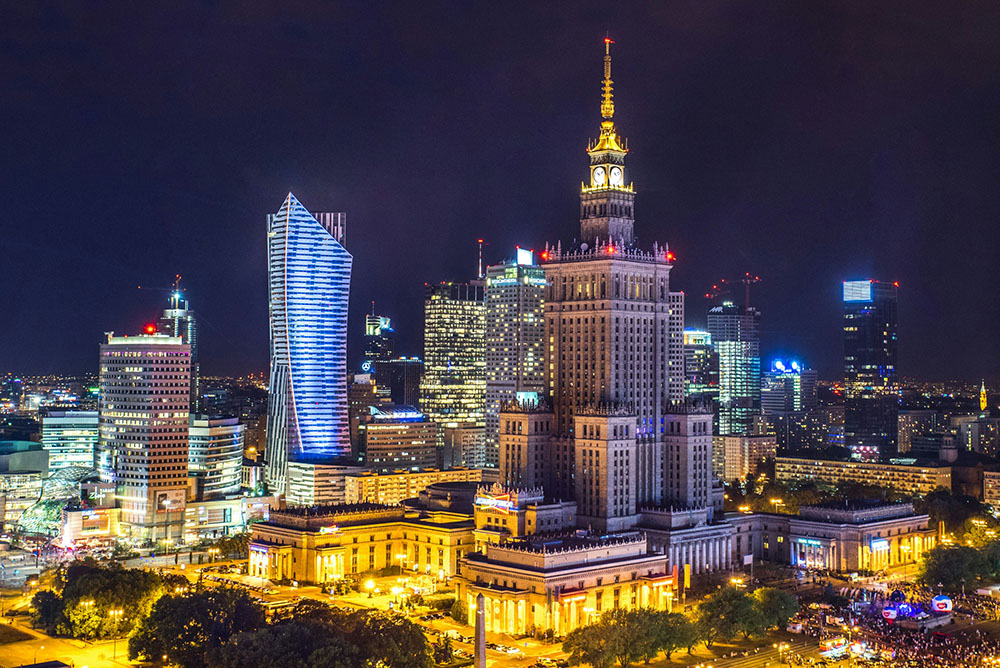
Deweloper 7R pozyskuje 52 mln zl z emisji obligacji na rozwoj europejskiego portfela magazynowego
7R zdobywa kapital na ekspansje magazynowa w kluczowych rynkach Europy Srodkowej.
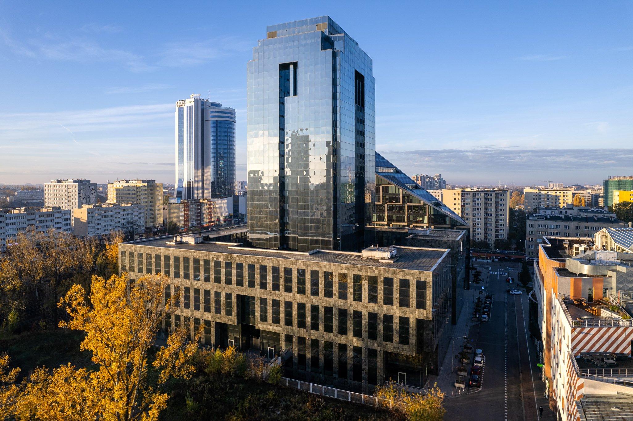
Architektura bliskosci - jak projektowac przestrzenie ktore lacza ludzi
Rozmowa o nowej generacji biur hybrydowych i przestrzeniach ktore odpowiadaja na potrzeby wspolczesnych zespolow.
Alerty / Toasty
4 warianty semantyczne. Inline (w formularzach i widokach) oraz toast (floating JS). Klasy: sg-alert + modyfikator koloru.
System Headings
Klasy .system-h1 - .system-h5 uzywaja fontu Manrope (glowny font UI). Klasy .heading-style-h* to font ozdobny magazynu - pozostaja bez zmian na tresciach editorial. Kanit zarezerwowany do zadan specjalnych.
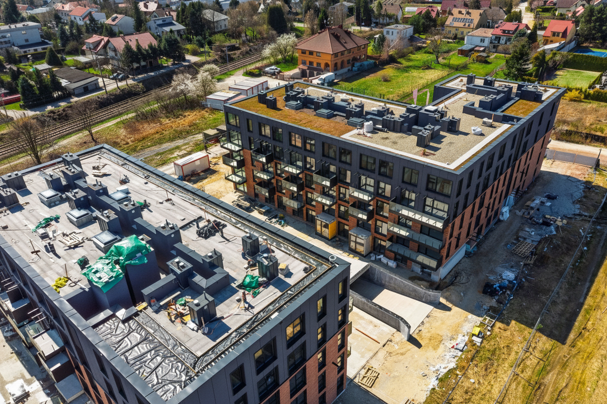
Obiekty 2026
Rynek nieruchomosci
Magazyny i logistyka
Sekcja przegladowa
Etykieta sekcji
Przestrzenie komercyjne przechodza transformacje. Hybrydowy model pracy wymusza nowe podejscie do projektowania biur.
Inwestorzy coraz czesciej analizuja wskazniki ESG przy wyborze aktywow. Certyfikaty BREEAM i LEED staja sie standardem w nowych inwestycjach.
Autor: Michal Maciejczak - 8 min czytania - 14 marca 2025
Zdjecie: Widok na kampus biurowy Warsaw Spire, fot. Ghelamco
Karty autorow
Wariant pelny (strona autora, lista redakcji) i kompaktowy (inline w artykule, sidebar). Awatar z inicjalami + kolor dzialu jako accent.
Pelny
Kompaktowy (inline / sidebar)
Pricing Table
3 plany. Wyroznioney plan (featured) z podwojnym borderem brand-500 i badge. CTA primary dla planu featured, secondary dla pozostalych.
Podstawowy
Dostep do artykulow ogolnych i newslettera.
- vArtykuly ogolnodostepne
- vNewsletter tygodniowy
- -Archiwum (3 lata)
- -Raporty branżowe
- -Dostep do eventow
Pro
Pelny dostep do magazynu i raportow ESG.
- vWszystko z Podstawowego
- vArchiwum (3 lata)
- vRaporty branżowe PDF
- vDostep do eventow online
- -Dostep dla zespolu
Enterprise
Dla firm i zespolow. Faktura VAT, SSO.
- vWszystko z Pro
- vDo 10 uzytkownikow
- vDostep dla zespolu
- vDedykowany opiekun
- vFaktura VAT + SSO
Tagi i Badge
Tagi do filtrowania kategorii. Badge’e do oznaczania statusów w kartach, tabelach i listach.
Tagi
Badge statusu
Klasy Webflow
Karty wydarzen
Thumbnail z data-badge. Kolory dzialu (violet, green, magenta...) jako gradient tla - elastyczne pod podstrony eventow. Klasy: sg-event-card, sg-event-thumb, sg-event-date-badge.
Kongres Nieruchomosci Komercyjnych 2026
Forum ESG w Nieruchomosciach 2026
Tabela danych
Header ink-100, zebra stripes ink-50, hover ink-100. Owijac w sg-data-table-wrap na mobile. Statusy jako sg-badge z kolorem semantycznym.
| Deweloper | Projekt | Lokalizacja | Powierzchnia | Status |
|---|---|---|---|---|
| 7R S.A. | 7R Park Poznan West II | Tarnowo Podgorne | 48 000 m² | W budowie |
| Panattoni | Panattoni Park Warsaw East IV | Nadarzyn | 72 000 m² | Planowany |
| MLP Group | MLP Poznan | Poznan | 30 000 m² | Ukonczony |
| Hillwood | Hillwood Wroclaw Bielany | Wroclaw | 55 000 m² | Wstrzymany |
Formularz prosty - kontaktowy
Mockup wizualny: input, select, textarea, custom checkbox. W implementacji Webflow uzyc natywnego Form Block jako wrappera, wtedy mozna uzyc prawdziwych inputow.
Formularz zlozony - rejestracja
4 sekcje z separatorami: dane osobowe, organizacja, newsletter z custom checkboxami i radio, zgody RODO. Grid 2-kol., select branzy.
Dane osobowe
Organizacja
Newsletter
Zgody